Friday, 7 October 2011

Weekly assignment 10

Postmodernism and Remix

Postmodernism and remix play an important role in the contemporary design. In an age of developed mass media such as television, computer and the internet, public in the mid-twentieth century were able to access countless number of images and information of different cultures and styles, from all over the world, as well as their own. This resulted in people creating their own art works in which they simply mixed the existing styles into their own techniques, creating something totally different while still retaining the traces of its original work. This new style provided designers not only with freedom, but also enabled them to push boundaries of what can once be seen as a stereotypical format of past designs. By having no restrictions, they were able to do what they desired and designs became more accessible to a broader range of different social classes.
 
The famous quote, ‘less is more’ by 'Ludwig Mies  van der Rohe', has always been considered as important in the history of design. (It was once what defined an idealistic modern style) However, the introduction of new style, post-modernism, allowed people see design in a different perspective. Simple and less have grown out to be rather boring and plain and people sought to see design as more into vibrant and ornamental.  Key characteristics of postmodernism are vibrant, ornamental eclecticism, kitsch, historical quotations, wit or irony and manipulations of scale.

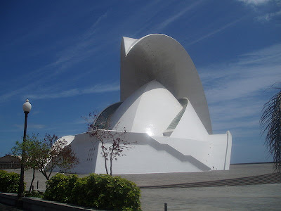
The picture above Auditorio de Tenerife designed by architect Santiago Calatrava Valls. Its enormous scale manipulation of 23,000 m², appealing curved ornamentations and use of vibrant colours give it a name of postmodernist architecture that exists today.
Wednesday, 5 October 2011

Weekly assignment 9

Throughout history the important objectives of designs have been to adress the needs of societies. Over the years the needs of societies and objectives have differed a lot.

During our lectures and readings, we investigated design campaigns held in the mid-twentieth century which used design as a form of propaganda to spread american ideals. One particular example was the American National Exhibition held in 1959. It was here that Kitchen Debate  took place, a series of impromptu exchanges (through interpreters) between the U.S. Vice President Richard Nixon and Soviet Premier Nikita khrushchev. This exhibition was meant to prove each country’s industrial accomplishments. The exhibition displayed an American-style kitchen which was furnished with high tech appliances and innovative designs. Therefore, the kitchen debate can be simply noted as both countries trying to promote the ideologies, as well as showing the comfortable and convenient lifestyle of their people.

Many of todays designs can be seen as having a lot of political and ideological messages that inform designs and brandings today. However, nowadays we look more towards the idea of being environmentally friendly and sustainable. The idea of consumerism and making a ‘better life’ still exists, but maintaining our planet and keeping it clean and healthy, has become a bigger issue. Global warming, also known as “Greenhouse effect”, is one of the major issues that is being critically discussed, not just politically but also in designs and brandings. 
http://www.google.co.nz/imgres?q=hybrid+vehicles&num=10&hl=en&biw=1600&bih=978&tbm=isch&tbnid=Yl2QXjb8SuWPGM:&imgrefurl=http://auto.701panduan.com/article-details.php%3Fid%3D230&docid=zVME0BjFWE6ICM&w=1300&h=867&ei=_hSMTpu0HoPImAWVpeiPBA&zoom=1&iact=hc&vpx=175&vpy=319&dur=31&hovh=183&hovw=275&tx=156&ty=98&sqi=2&page=1&tbnh=142&tbnw=185&start=0&ndsp=35&ved=1t:429,r:7,s:0

Hybrid vehicles are one of the sustainable designs that exist today. Hybrid vehicles use two or more distinct power sources to power the vehicle. These consist of electric motors and fuels that help to reduce down the carbon admission. Although they are not very appealing, hybrid vehicles help to keep our planet clean and healthy. 


Reference:

http://en.wikipedia.org/wiki/Sustainable_design
http://en.wikipedia.org/wiki/Kitchen_Debate
http://en.wikipedia.org/wiki/Hybrid_vehicle

Thursday, 22 September 2011

Weekly assignment 8


In this week’s reading, “The First Machine Age in Europe” by David Raizman, Hannes Meyer argued that ‘design is a product of “function x economic”’.


I disagree with Meyer’s idea as his idea narrows down the meaning of ‘Design’. To me design is something that embodies designers’ personality,style, and creativity while achieving its purpose and function. I believe that both aesthetics and function are important and should remain equal; Design cannot be determined as either art nor science, but a collaboration of both. However, Meyer's idea was based solely on the fact that design should only serve function, not aesthetics, and that they should only be built by the means of technology and science. I believe his idea marginalizes the value of fine art and separates art from design.

http://www.google.com/imgres?q=dysans+fans&hl=ko&sa=X&noj=1&biw=1366&bih=700&tbm=isch&prmd=imvns&tbnid=-53nmOuTgK92OM:&imgrefurl=http://inhabitat.com/dyson-aims-to-replace-air-conditioning-with-new-bladeless-fans/&docid=fwVS_1KUklbsOM&w=537&h=421&ei=DIp7TpeTA-HomAXB5bXOAQ&zoom=1&iact=rc&dur=2893&page=1&tbnh=156&tbnw=183&start=0&ndsp=17&ved=1t:429,r:10,s:0&tx=20&ty=67


The above images are of Dyson fans and fan heaters. These are designed to have no blades or heating elements and are created using modern science and technology. Their modern and simple minimalistic designs attract many consumers, especially minimalist supporters. Dyson fans serve what other normal fans currently do, but go a step further by taking into consideration of thier users’ safety while still being aesthetically pleasing. 


Meyer is right where he pointed out that technologies should be applied to design. Technologies now-days have developed to the stage where they allow us achieve far more advanced and complex designs which handmade crafts cannot reach. However, I disagree with his point of function and economy over aesthetics, as it limits the potential of how far design can reach. Aesthetics take a major role in design and is important as function itself. To me, a good design should show how well function and aesthetics reflect one another and are collaborated together. 


 Reference
David Raizman (2003). Chapter 9: The "first Machine Age" in Europe. In History of Modern design (pp. 166-191). Laurence King Publishing.

Thursday, 15 September 2011

Weekly Assignment 7 - Symbolic Universe

In recent days, “symbolic universe” is displayed in a variety of media. Particularly in movies, symbolic universe is used to show and display the lives of fantasy. The film, Avatar, is a great example of a film where symbolic universe is shown.

The symbolic universe in Avatar displays the harmony created between Navi and nature, and their respect towards it. This is quite a different concept of symbolic universe to what was displayed in the World’s fairs of the early 1900s. They presented symbolic universe and believed that the fantasy came from advancements in technology and science, and beliefs for a better life tomorrow. However,  the beliefs of Navi in symbolic universe are portrayed through nature where Eywa; their mother of nature, helps them to get through every day and provide them with a belief in times of sorrow. The film concludes by leaving a moral message suggesting men should not take control of nature. However, this contrasts with Buffalo World’s fair 1901, where man is seen to have gained power over nature through generating electricity from Nigara Falls. Not only that, the film also concludes by showing viewers with importance of cultural unity and harmony. Again contrasting with Buffalo World’s fair where colours were used in architectural plans to show cultural hierarchy.


Reference
The social Construction of Reality, Society as Subjective Reality. http://en.wikipedia.org/wiki/The_Social_Construction_of_Reality
Kihlstedt, F. T. (1986). Utopia Realized: The World’s Fairs of the 1930s. In Imagining Tomorrow: History Technology, and the American Future (pp. 97-119). Cambridge, Massachusetts, United States of America: MIT Press.

Thursday, 8 September 2011

Weekly Assignment - 6

In “The Work of Art in the Age of Mechanical Reproduction” by Benjamin Walters, he argues that To an ever greater degree the work of art reproduced becomes the work of art designed for reproducibility. From a photographic negative, for example, one can make any number of prints; to ask for the authentic print makes no sense.”
What is Authenticity in photographs? I believe authenticities in photographs rely, not on the photographs themselves, but on the moment at which photographer takes the shot. The moment when the photograph was taken will remain an authentic image only to the photographers themselves as they hold the firsthand experience.
Therefore I agree to Walter’s argument and believe authenticity do take role in an age of digital design and manufacture. It does not matter which photograph is original or not, but personal connection and emotional meaning of their own work which remain in the image of individual’s mind are what defines the true meaning of authenticity.

Thursday, 11 August 2011

Weekly Assignment 5 - Colour of the mind

For the past centuries in history, people have sought out to find the true meaning of colour.
The first person to study the colour optics was Isaac Newton, a physicist and mathematician in 17th century. His belief of colour was that we perceive colour purely from the basis of scientific and mathematical background. Long after Newton’s belief, came an opposing believer, Johann Wolfgang von Goethe, a German writer and a poet. (Gage, J. (1993). Colours of the Mind in Colour and Culture: Practice and Meaning from Antiquity to Abstraction P.201) He believed that colour is something that human perceives internally, not externally; Newton belief. He believed that colour is perceived differently with different people, that there are psychological and emotional reasoning behind how we perceive colour. Whereas Newton, who trusted in sensation of eye, believed that colour is something that is depicted purely on the basis of how the human eye is formed (science).

Goethe’s belief in later period influenced artists such as Turner and Runge. Similar to Goethe, these artists believed that colour should have symbolical meaning in them. This resulted in impressionism, a style of art where often depiction of “real experience” was the main purpose. This created style of painting called optical mixing, where a lot of dots are being used to express how the eye perceives colors that abut or overlay each other to give out more vitality in paintings. Then came post-impressionism. Post-impressionists believed that art was lacking subjectivity and wanted to depict feeling rather than representation of a scene. Often symbolical meanings are used in post-impressionism paintings and abstract depictions in colours can be defined as most dominant sources.


Such impressionistic values are shown in “His vision of the cafe at Arles”, by Van Gogh. He used colours that clash to another to express the feeling of what he has experienced. These clashing of colours help to depict “terrible passions of humanity”;red, green and yellow appear rather disgusting. (Gage, J. (1993). Colours of the Mind in Colour and Culture: Practice and Meaning from Antiquity to Abstraction P.196)

Thursday, 4 August 2011

Weekly assignment 4 - Ornament and Crime

In Ornament and Crime, 1908, Adolf Loos argues The evolution in culture is synonymous with the removal of ornament from objects of daily use.
He believed that there were no need for ornaments in both functional and form wise, and that it would only affect economics to go down and labour to be wasted while trying to create something ornamental. Furthermore, he sees that it is more important for designers to focus more on showing their creativity rather than trying to create ornaments in their works. He believed by having high levels of architectural utilities, it helps to express more beauty more than having decorations on the architecture.

http://www.homedosh.com/search/minimalist+desk
Loos idea is the origin of the minimalistic styles we see today. I believe that our generation have carried Loos style too far, even to the stage of omitting out not only unnecessary ornaments but also necessary parts as well, as seen on the image above. Above image is a minimalistic desk, designed by Peter Petersen. This desk is sleek and fashionable, but functionally, it lacks from other desk designs that are not minimalistic style. This desk has three drawers and nothing else, even the handle knob of the drawers which are necessary. Therefore, I do not agree with Loos statement, that evolution in culture is synonymous with the removal of ornament. Even though he stated that ornaments do not serve any functions, ironically the style he has resulted in ignores the function-ability of the product in-order to achieve beauty. He stated that designers should focus more on trying to depict their creativity rather than to create ornaments; however, I believe that taking ornaments from design is like taking away a part of designers creativity and limiting it to a certain amount.